Reel Cover Design That Gets Clicks: Faces, Text, and Contrast That Work on a Grid
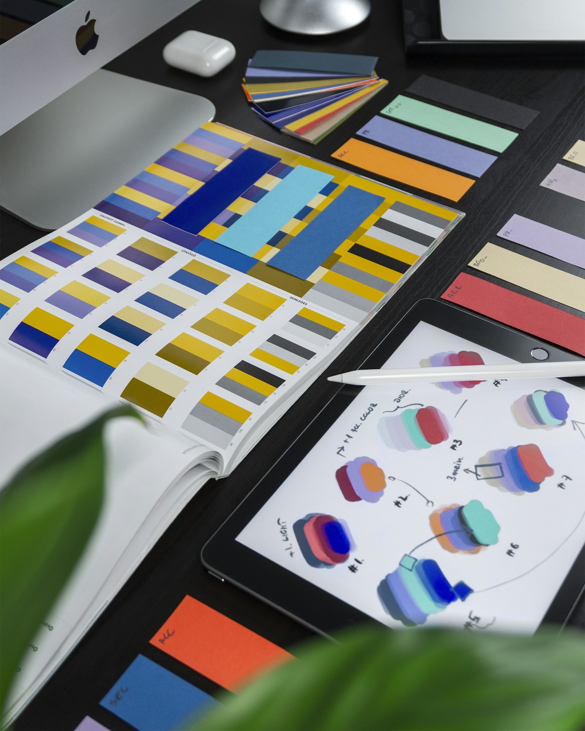
- Primary Signal: Reel Cover Design That Gets Clicks: Faces, Text, and Contrast That Work on a Grid
- Overview: Your cover is the thumbnail viewers judge on your profile grid and in search. Learn how to design covers with a clear face or visual, short text, and strong contrast....
- Verification: Analyzed and compiled by ReelHub Live editorial monitoring desk.
Most viewers first meet your reel through its cover, whether on your profile grid, in search results, or in a suggested feed where the cover competes with dozens of others. A weak cover makes even a great reel easy to skip, while a clear cover earns the click that lets the hook do its work. Cover design is not about fancy graphics; it is about instant clarity. In less than a second, a viewer should understand the topic, feel curious, and trust that the reel is worth opening.
Start with one clear visual, not a collage of everything in the video. A close-up face with a genuine expression, the finished result of a tutorial, or a single striking object will read far better at small sizes than a busy scene with many details. When you shrink your cover to phone-grid size, check whether the main subject is still obvious. If it becomes a blur of colours and shapes, simplify it: crop tighter, remove background clutter, or choose a different frame from the video. One strong visual beats five competing ones every time.
Text on the cover should be short, bold, and readable without zooming. Three to six words is usually enough to state the promise, such as a mistake, a result, or a question the reel answers. Use a large, clean font with strong contrast against the background, and avoid thin fonts, low-contrast colours, or text placed over busy areas of the image. Test the cover at grid size on your phone, not just on a large editing screen, because text that looks fine large can become unreadable small. If viewers cannot read the text instantly, it is not helping the click.
Contrast and colour also drive clicks, but they should support the topic, not shout over it. A bright accent colour for the text, a dark overlay behind the words, or a clean border can make the cover stand out on a grid full of similar images. Avoid using the same loud colour scheme for every cover, because your grid will start to look repetitive and viewers will stop noticing individual reels. Instead, keep a consistent style, such as the same font and layout, while varying the image and accent colour to match each topic. Consistency builds recognition; variety keeps curiosity alive.
Your cover must match the reel honestly. A cover that promises a transformation, a result, or a secret that the reel does not deliver will earn a click but lose trust, and viewers who feel misled are unlikely to follow or return. The best covers highlight the most interesting true moment from the reel, not an exaggerated version of it. If your reel is a tutorial, show the finished step; if it is a story, show the emotional peak; if it is a tip, show the problem it solves. Honest curiosity outperforms clickbait over time, because it builds an audience that clicks repeatedly.
Think about how the cover looks in context, not on its own. On your profile grid, covers sit side by side, so a set of covers with similar layouts will look professional and make your niche obvious at a glance. Check your grid after publishing a few covers: does it look varied yet coherent, or does it look random and messy? Small adjustments, such as consistent text placement, a similar font, and a clean margin around the edges, can transform a grid from cluttered to inviting. New visitors often judge whether to follow from the grid alone, so the collective look matters as much as any single cover.
Avoid common cover mistakes that quietly reduce clicks. Do not place important text where platform buttons or captions will cover it, do not use low-resolution screenshots that look blurry, and do not fill the cover with hashtags, logos, or watermarks that distract from the message. Also avoid covers that are only text with no visual, because they blend into a feed full of text posts and give viewers no emotional reason to tap. A cover needs both a visual hook and a textual promise, working together in a clean layout.
Before you publish, run a quick cover test: show the cover to someone unfamiliar with the reel for two seconds and ask what they think it is about. If they guess correctly and feel curious, the cover works. If they are confused or indifferent, simplify the visual, shorten the text, or increase the contrast and test again. Cover design improves quickly with this kind of feedback, and over time you will develop a reliable style that earns clicks without misleading viewers. Treat the cover as the front door to your reel, and make it welcoming, clear, and honest.
📖 Continue Reading the Full Story
Continue reading this article on ReelHub Live.
⚡ Access Full Content NowMore from ReelHub Live



 🔥 ViralBuzz 168
2026 Content Creator Awards Light Up Sandton Tonight With Music, Dance and Star Power
The 2026 Samsung Galaxy Content Creator Awards take over The Galleria in Sandton on October 17, celebrating So...
 🍿 CosmoCinema 998
Beginner to Advanced: Palworld Breeding Calculator — Parents, Combos & Paths (Day 5 Guide)
How to maximize results using the Palworld Breeding Calculator — Parents, Combos & Paths on CosmoCinema 998. D...
 ⚽ SportsBet Insights Live
How Betting Odds Work (Explained So Simply Anyone Gets It)
Decimal, fractional, American — every odds format explained in plain English, plus how to convert odds into pr...
 🎰 WinBar VIP
Comprehensive Guide: Freelancer Net Pay Calculator (PKR) — Upwork, Fiverr & Payoneer Fees (Day 1 Guide)
Everything you need to know about Freelancer Net Pay Calculator (PKR) — Upwork, Fiverr & Payoneer Fees on WinB...